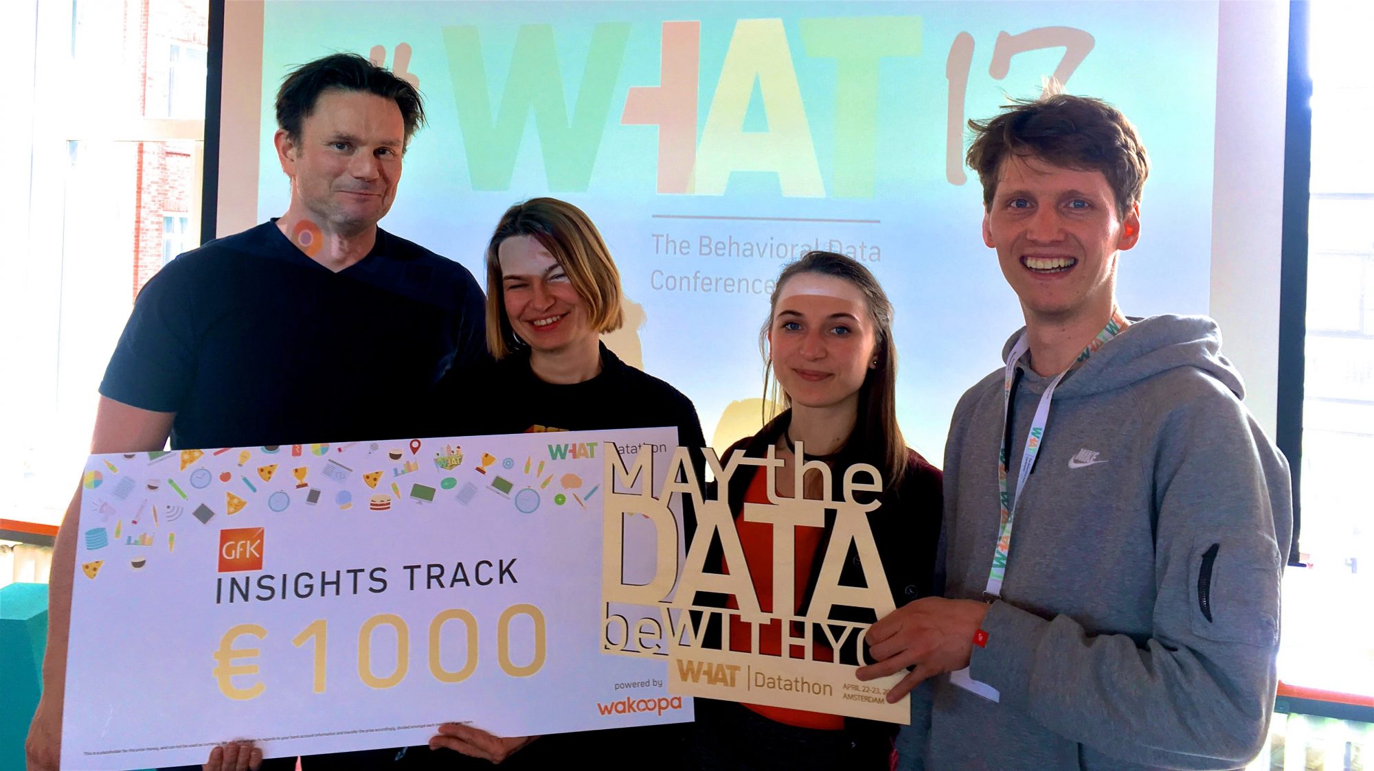
Last weekend we took part in the WHAT datathon – a data science competition accompanying the WHAT behavioral data conference organized by Wakoopa.
And YES, we won the Gfk Insights track!
THE CHALLENGE
The challenge was to uncover business insights in clickstream data. We got data of one month in 2016 of a Dutch panel that shows how people have been using their connected devices (pc’s, tablets and smartphones). This includes which websites, search terms and apps they have been using, at what time and for how long.
The question we asked ourselves was: how can we use this data to better understand online journeys of fashion shoppers. Most online shops are able to understand their customers behavior in their own shop, but what they don’t know, is:
- How this behavior compares to people’s behavior in different shops
- How people navigate through different shops on their path to purchase
What makes Wakoopa’s data so great, is that you can answer that sort of questions. So our goal was to visualize people’s behavior across different fashion webshops, to uncover interesting patterns and customer segments.
The challenge here is: each of these paths is unique. So how to visualise it in a meaningful way?
THE SOLUTION
The approach we took is:
- Find the right path representation, that is find the right level of detail
- Use clustering algorithms to group paths into meaningful segments
- Use Rax– a scripting language developed especially for crunching behavioral (big) data
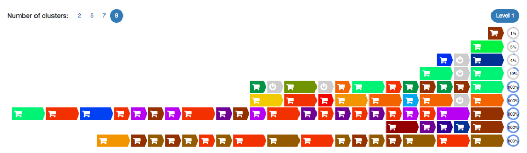
Our winning solution was an interactive dashboard in which we visualized fashion shoppers’ journeys across different shops together with many demographic variables available in the Wakoopa’s dataset. We have used a hierarchical clustering algorithm with a custom distance function to split the journeys into 9 distinctive clusters:
The approach we took is:
- Find the right path representation, that is find the right level of detail
- Use clustering algorithms to group paths into meaningful segments
- Use Rax– a scripting language developed especially for crunching behavioral (big) data
Our winning solution was an interactive dashboard in which we visualized fashion shoppers’ journeys across different shops together with many demographic variables available in the Wakoopa’s dataset. We have used a hierarchical clustering algorithm with a custom distance function to split the journeys into 9 distinctive clusters:
- just a look journey: very short (avg. 2 minutes), single session, only 1 shop visited, very low conversion probability
- consider journey: significantly longer (avg. 30 minutes), single session, 1 shop, somewhat higher conversion probability
- come back to consider journey: 2 sessions, one short followed by a longer one, both in the same shop, still quite low conversion rate
- keep considering journey: 2 long sessions, both in the same shop, significantly higher conversion rate
- compare my favorite shops journey: more than 2 sessions, 3-4 different shops, a mixture of longer and shorter sessions, high conversion rate
- compare all the shops I can find, sleep on it, then come back and buy in the best onejourney: 2 sessions, 5-8 different shops, mostly longer sessions, high conversion rate
- check many shops, figure out two best, then can’t decide in which shop to buy journey: different shops at the beginning then a lot of switches between 2 or three different shops, high conversion rate
- compare all the shops in one sitting journey: single session, many different shops, but not too much time spent in each shop, high conversion rate
- can’t chose between my two favourite shops journey: only 2 shops, but a lot of switches back and forth, high conversion rate
Clearly longer sessions are a strong indicator of an intention to buy, which is not surprising. However, what we also uncovered, is that people who are about to buy (Dutch people at least :-)), often visit many different shops earlier in their journeys.
Since our dashboard was interactive, we could also quickly uncover which shops have which types of journeys. We discovered some surprising things here: some big players seemed to have a lot of traffic, but the journeys turned out to be mostly of the ‘just a look’ type, with low conversion rate, while a number of smaller shops had a much more engaged audience.
This is just the top of the iceberg when it comes to the insights our dashboard provided. The advantage of visualising the data in this way, is that you can quickly uncover many, many surprising insights you would never even look for otherwise.
And thanks to Rax, a language that is super efficient in dealing with behavioral data, we created this dashboard in under 16 hours! Just imagine what we could do if we had 3 days…
As one of the winners, we got an opportunity to present our solution at the WHAT behavioral data conference. We’ve got a lot of interest from market research companies from around the world, who realise the great potential of this type of data, but struggle to analyse it efficiently.